So here we are in 2025, hype everywhere, yet 95% of AI projects fail.
But there's one LLM capability I can't stop being fascinated by: how effortlessly AI handle translation. Not just from 中文 to русский or español to Deutsch, but from natural language to structured data.
In my view, that's one of the best real-world ways to leverage AI in products along with code generation and RAG.
One company that nails this is Linear, with their AI-powered filters.
Instead of memorizing syntax like label:bug AND status:todo or even needing to learn specific query languages (e.g. JQL for JIRA, HogQL for PostHog), you can simply type:
Demo
Try it yourself, by typing e.g. "show me unfinished bugs from customer support."
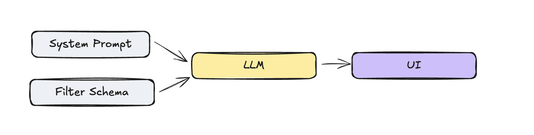
Building Blocks
The ingredients are surprisingly simple. All we need is a system prompt, a filter schema, and an LLM parser and a UI to display the results.
System Prompt
We will use gpt-4o-minifor this example. The system prompt is surprisingly minimal but effective. We add the current date, to support relative date queries ("bugs since last week").
Parse natural language filter descriptions into structured JSON format.
If you see multiple conditions, return an array of conditions.
If the user asks for a filter that is not possible, return an empty array.

# Examples
- "features that we shipped last week"
  (label: include, value: feature; date: after, value: "date from last week", unit: days)

- "bugs from customer support"
  (label: include, value: customer-support; label: include, value: bug)

Today's date is 2026-07-21
Filter Schema
Filters are hard, especially when they happen in conjunction. I kept it simple in this example, using the three filter types date, label, and status.
before and after operatorsinclude and not_include operatorsis operatorI used Zod schema for validation and parsing the filter schema.
const labelFilter = z.object({
  name: z.literal("Label"),
  type: z.literal(FilterType.LABEL),
  operator: z.enum(["include", "not_include"]),
  value: z.array(z.enum(["bug", "feature", "customer-support"])),
  selectedValue: z.array(z.enum(["bug", "feature", "customer-support"])),
});

// … same for status and date filters

// Union of all possible filter types
const filterCondition = z.discriminatedUnion("type", [
  dateFilter,
  labelFilter,
  statusFilter,
]);

// Final parsed output structure
export const parsedFilter = z.object({
  conditions: z.array(filterCondition),
  raw_input: z.string(),
});{
"conditions": [
{
"name": "Label",
"type": "label",
"operator": "include",
"value": ["bug", "feature"],
},
{
"name": "Status",
"type": "status",
"operator": "equals",
"value": ["done"],
}
],
"raw_input": "label include bug and feature"
}Parsing via LLM
Now that we have the filter schema, we need to parse the user input into the filter schema. The core parsing happens in a single API call with structured outputs. The magic here is zodResponseFormat which is a helper function that allows you to parse the response into a specific format. This guides the LLM to the example format we defined in the filter schema above.
export async function parseFilterAction({ input }: { input: string }) {
  const completion = await openai.chat.completions.parse({
    model: "gpt-4o-mini",
    messages: [
      { role: "system", content: SYSTEM_PROMPT },
      { role: "user", content: input },
    ],
    response_format: zodResponseFormat(parsedFilter, "parsed_filter"),
  });

  const parsed_filter = completion.choices[0].message.parsed;

  if (!parsed_filter) {
    return { success: false, error: "No parsed filter returned" };
  }

  return { success: true, data: parsed_filter };
}
Now that we know the filter schema, how to get the translation from the LLM, we take a quick look how to display it.
UI
Alongside ▲ Vercel, Linear is the benchmark for modern web apps, from design simplicity to product innovations like applying reasoning models to task management (see Product Intelligence).
One notable one is that they don't use cursor: pointer on any elements (see also Tailwind removed it in V4 which is even mentioning Linear explicitly).
Little details make a difference, for example how they do the inital loading animation. One skeleton builds after another to indicate that its building up and not just loading all at once, easily achievable by using the delay and duration on the Skeleton component.
<Skeleton className="w-[180px] h-7 animate-pulse delay-0 duration-[2s]" />
<Skeleton className="w-[100px] h-7 animate-pulse delay-500 duration-[2s]" />
<Skeleton className="w-[140px] h-7 animate-pulse delay-1000 duration-[2s]" />
More of a subtle detail is that they don't use any text selection (aka user-select: none;) except on editable fields like the issue title and description. High chances this is to make the app feel more native.
Another exploration was the status indicator for the issue list items, technically not needed to create the filter UI, but still a nice detail.
Here I use a simple SVG to a a cirlce for the outline and a path for the fill.
<svg
  viewBox={`0 0 14 14`}
  width={14}
  height={14}
>
  <circle
    cx={14 / 2}
    cy={14 / 2}
    r={6}
    fill="transparent"
    stroke={"yellow"}
    strokeWidth={2}
  />
  <path d={d} fill={"yellow"} />
</svg>
The d is then generated by the arc function. We render a DoneCircle component if the status is done. And for the backlog status, we use a strokeDasharray to create a dashed line on the circle.
import { Check } from "lucide-react";

type StatusValues = "backlog" | "todo" | "in_progress" | "in_review" | "done";

const SIZE = 100;

function arc({
  cx,
  cy,
  r,
  percent,
}: {
  cx: number;
  cy: number;
  r: number;
  percent: number;
}) {
  const startPercent = 0;
  const startAngle = startPercent * 360 - 90; // start at 12 o'clock
  const endAngle = percent * 360 - 90;
  const rad = (deg: number) => (Math.PI / 180) * deg;

  const point = (angle: number) => ({
    x: cx + r * Math.cos(rad(angle)),
    y: cy + r * Math.sin(rad(angle)),
  });

  const start = point(endAngle);
  const end = point(startAngle);
  const largeArc = percent - startPercent > 0.5 ? 1 : 0;

  return `M ${cx} ${cy} L ${end.x} ${end.y} A ${r} ${r} 0 ${largeArc} 1 ${start.x} ${start.y} Z`;
}

const COLOR_MAPPING: Record<StatusValues, string> = {
  backlog: "#A8A8A8",
  todo: "#A8A8A8",
  in_progress: "#F1BF00",
  in_review: "#E99243",
  done: "#27A644",
};

export const DoneCircle = () => {
  const circleRadius = SIZE / 2;
  const gap = SIZE * 0.1;

  return (
    <div
      className={`bg-[#5F6AD3] rounded-full flex items-center justify-center relative`}
      style={{
        width: `${circleRadius * 2}px`,
        height: `${circleRadius * 2}px`,
      }}
    >
      <Check
        className={`stroke-[3px] pt-[1px] text-white translate-y-[5%]`}
        style={{
          width: `${circleRadius * 2 - gap}px`,
          height: `${circleRadius * 2 - gap}px`,
        }}
      />
    </div>
  );
};

const getStatusByPercent = (percent: number) => {
  if (percent >= 1) return "done";
  if (percent >= 0.75) return "in_review";
  if (percent >= 0.5) return "in_progress";
  if (percent > 0) return "todo";
  if (percent == 0) return "backlog";
};

export const StatusIndicator = ({
  percent = 0.5,
}: { percent?: number }) => {
  const status = getStatusByPercent(percent);
  const color = COLOR_MAPPING[status];

  // Set stroke width as a percentage of SIZE, e.g. 10% of SIZE
  const strokeWidth = SIZE * 0.1;

  // The radius should account for the stroke width so the circle fits inside the SVG
  const circleRadius = SIZE / 2 - strokeWidth / 2;

  // Add spacing between the arc and the outer circle
  const arcGap = 10; // pixels of space between arc and outer circle
  const arcRadius = circleRadius - arcGap;

  const d = arc({
    cx: SIZE / 2,
    cy: SIZE / 2,
    r: arcRadius,
    percent,
  });

  const fill = color;

  return (
    <div className="p-12">
      <div className="scale-125">
        <div className="flex items-center justify-center">
            {status === "done" || percent === 1 ? <DoneCircle /> : (
                <svg
                    viewBox={`${SIZE} ${SIZE}`}
                    width={SIZE}
                    height={SIZE}
                >
                    <circle
                        cx={SIZE / 2}
                        cy={SIZE / 2}
                        r={circleRadius}
                        fill="transparent"
                        stroke={fill}
                        strokeWidth={strokeWidth}
                        strokeDasharray={status === "backlog" ? "1.5,2" : undefined}
                    />
                    <path d={d} fill={fill} />
                </svg>
            )}
        </div>
      </div>
    </div>
  );
};
Check the code here Status Indicator.
Sub Components
The Filter component includes the sub components FilterDropdown and FilterPill and the IssueList component.
Filter Dropdown
The FilterDropdown component uses shadcn's Popover component in conjunction with a CommandList component to render the list of items. I only renders one item along a few placeholders to call the AI filter function.
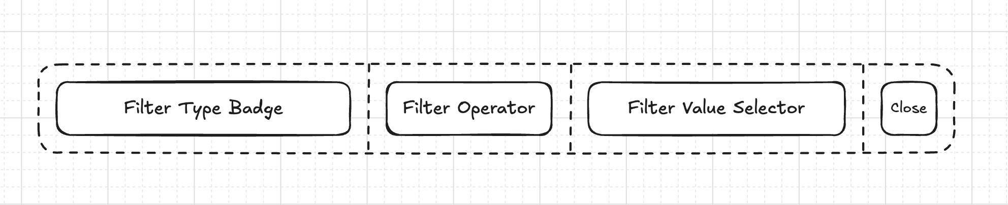
Filter Pill
The FilterPill renders the sub components FilterTypeBadge, FilterOperatorBagde, FilterValueBadge, and FilterClose.
Filter
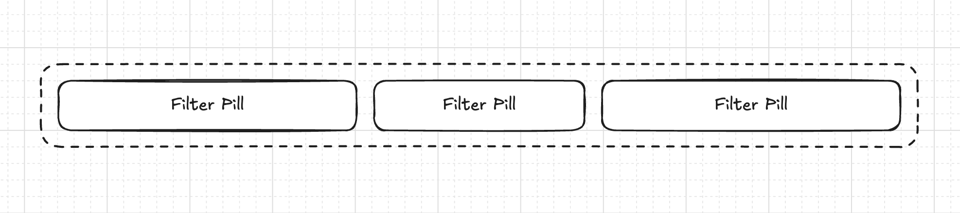
It all comes together in the Filter component where we iterate over the FilterPill components or only show the FilterDropdown if there are no filters.
<FilterPill
  filter={{
    name: "Date",
    type: FilterType.DATE,
    value: "2024-01-01",
    operator: "after",
    selectedValue: ["2024-01-01"],
    unit: "days",
  }}
  onRemove={() => {}}
/>
Cost
Using gpt-4o-mini at $0.15 per 1M input tokens and $0.60 per 1M output tokens, the system prompt contains 138 tokens and the response JSON roughly 88 tokens.
Resulting in request cost of $0.000074 . Assuming 5 requests per user per month for 100,000 users this is around $1,110.00 per month .
Given the potential benefits this has for users, thats a pretty good price point. And I'm pretty sure you can get the cost down even further by using a cheaper model or tuning your own.
Conclusion
I was actually surprised how well it worked, and how easy it was to implement. And the cost is pretty reasonable. This pattern works beyond just filters, as you may already know, but the key is starting simple with a well-defined schema, then, and only then, expanding for further features.
As the MIT study showed, generic tools are slick enough for demos, but die immmediately in more complex workflows as of now. Probably we should start with the autonomy slider on the left.
You can find the source code on GitHub.